Recently I decided to plug a .csv file I’ve been using with ArcGIS into Google Fusion Tables. The file is a test dataset containing, among other things, information on where prints by Isaac Cruikshank were published and where these prints depict (both specifically and generally). Although far from complete, it has got me thinking about the relationship between place and publication, and the yearly trends evident in the Cruikshank corpus.
Anyhow, I plugged this into a fusion tables so I could play with another geospatial tool, but in the end I just started messing around with network graphs. And I’m not the only person who has been doing this recently (nor it seems the only person who has no idea what this means).
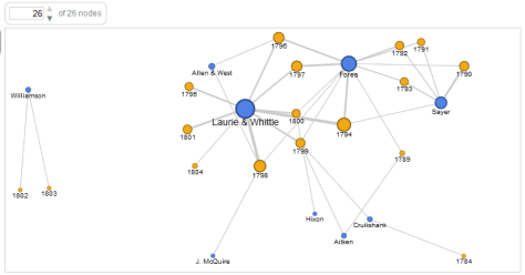
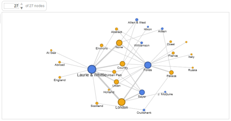
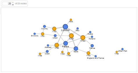
I’ve included some visualisations of data derived from Isaac Cruikshank prints below. The first plots publishers against year. The second plots publishers against general place depicted. The third plots general place depicted against year, for prints published by Laurie & Whittle. And the fourth plots general place depicted against year, for prints published by Samuel Fores.
Although the dataset is far from complete (containing only 171 of circa 1000 prints) there are signs of patterns emerging from the network grphs (many of which I expected). Though I expect that traditional graphs and tables could do just the same… I’ll continue playing and report back if the visualizations produce anything of note.


2 thoughts on “Google network graphs”