One elusive aspect of the Georgian satirical print trade which fascinates me is the print run. Although there are various estimates of the average number of times each design was printed (usually 500-1000), we really don’t know what a typical number was. Neither can we ascertain with any certainty how many of an individual design was printed, although the appearance of pirate copies of a design – either in paper or on pottery – do give a sense of its popularity. A further indicator of a design’s popularity in this period is the appearance of a second copper plate. Publishers – it can be surmised – commissioned second plates of a design when it was so in demand that the original plate had been damaged during the printing process. There are a number of reason why damage might occur: the printer might have put uneven pressure on the plate when forcing it through the rollers, wear and tear on the soft copper may have made the engraved or etched lines no longer capable of holding ink with sufficient precision, or mistakes in the etching – rubbed out by the use of a burnisher – may have been opened up by the pressure on the plate thus revealing unwanted ghost lines in the printed version. Either way, copperplates could not print perfect impression for long and with paper so expensive in the Georgian period print publishers would have keen to avoid a plate returning poor quality stock which might provide insufficient monetary return.
One window we have into the printing process is through closely examining multiple copies of the same print. This week whilst digging through the Isaac Cruikshank collection at the British Museum, I noticed a number of interesting dissimilarities. Although none of the prints I consulted were clearly popular enough to warrant a second plate, some did – it seems – warrant retouching by the artist (or, perhaps, a copperplate engraver who formed part of the publisher’s network).
Take a close look at the figure of Charles James Fox in the two close-ups below. Notice the extra hatching on his hat, arm, beard, and shoes in detail 1 compared to detail 2. The reason for this is initially unclear. However if we look at the print in full we might suggest that the design was retouched to increase the prominence of Fox in the print. Perhaps having released the print a friend, colleague, or even family member suggested to Cruikshank that Fox was too faint and needed bringing forward in the image. Sadly, we shall never know for sure, but the simple fact that an effort was made to change the print demonstrates that designs were not fixed entities and were subject – even after first publication – to revision.

A second design illustrates this dynamic even more clearly. The Cruikshank/Fores print Revolutionshows a petulant and childish Louis XVI attempting to resist the new French constitution being drafted by the National Assembly. Note how in the colour version the words ‘a new constitu tion’ are written in ink on the scroll the French King is tearing apart. However on the black and white version the words ‘New Constitu tion’ are clearly printed from markings on the copperplate. What is going on here? The first thing to note is that this wording aside the two versions of the print are identical. In short, they clearly come from the same plate. My intuition tells me that one of two things happened after the print was first published: either it was suggested to the artist that the words ‘New Constitution’ were added to the design, or – more likely – Samuel Fores, cautious of not offending his Bloomsbury clientèle, decided to initially leave off this potentially inflammatory anti-monarchist wording and only instructed the artist to include it once he was sure the print had not received any negative attention. What a comparison of these two impressions offer us then, is a valuable glimpse into the relationship between artists, publishers, and consumption.

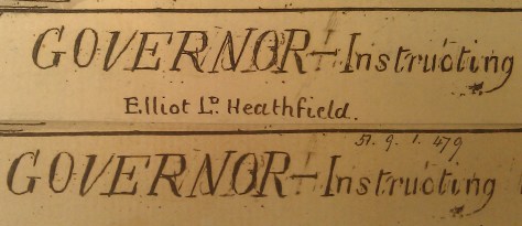
Finally, two copies of the Cruikshank/Fores Terror to the dons or the governor-instructing his little family illustrate nicely the impact of wear and retouching on a plate. It is clear from close scrutiny of the titles of the two impressions (see below) that the top impression has been retouched. See, for example, the firmness of its ‘g’ compared to bottom impression. How can I be sure that the top impression is a later impression? First look to the top right of the capital ‘O’. In the top impression the ghosting caused by an initial error (which, if we recall, would have been rubbed out with a burnisher) is more prominent. This is because the more the plate was used the more the unwanted lines were forced open by the printing press and hence could take on more ink. Second look at the bottom right corner of the same ‘O’ in each impression. You’ll notice that in the top (later) impression there are some scratchy marking in the letter of the ‘O’. This suggests, once again, that the top impression has come from later in the print cycle than the bottom impression, because in the top impression the imprecise scratching used to make the firm and consistent ‘O’ in early impressions has been revealed by the pressure exerted on the plate during printing.

These sorts of observations are helping me think through the life of a plate and how artists and publisher alike treated it as a unstable and unfinished object. What this might mean for our understanding as a trade as a whole, I hope to better explain over the coming months.
References:
Robert Darnton, The business of enlightenment: a publishing history of the Encyclopédie, 1775-1800(1797). Especially chapter five, ‘Bookmaking’.
Mary S Pedley, The commerce of cartography : making and marketing maps in eighteenth-century France and England (2005).
Coolie Verner, ‘Copperplate printing’, pp. 51-76, in David Woodward (ed.), Five centuries of map printing (1976).
