
Following some more rummaging around antique shops, a couple more prints have come into my possession. The first – The Coachman – is another rather lovely early-nineteenth century sporting print by Thomas McLean and Henry Alken from the same series as some other prints I purchased earlier in the summer. The second is a simple architectural print, engraved by Pierre-Charles Canot in 1773, that depicts my adopted part of the world. Both, as you’d expect from me, are up on Wikimedia Commons for you to use and reuse at your leisure (The Great Hall of the Archbishops’ Hall, Canterbury; The Coachman).
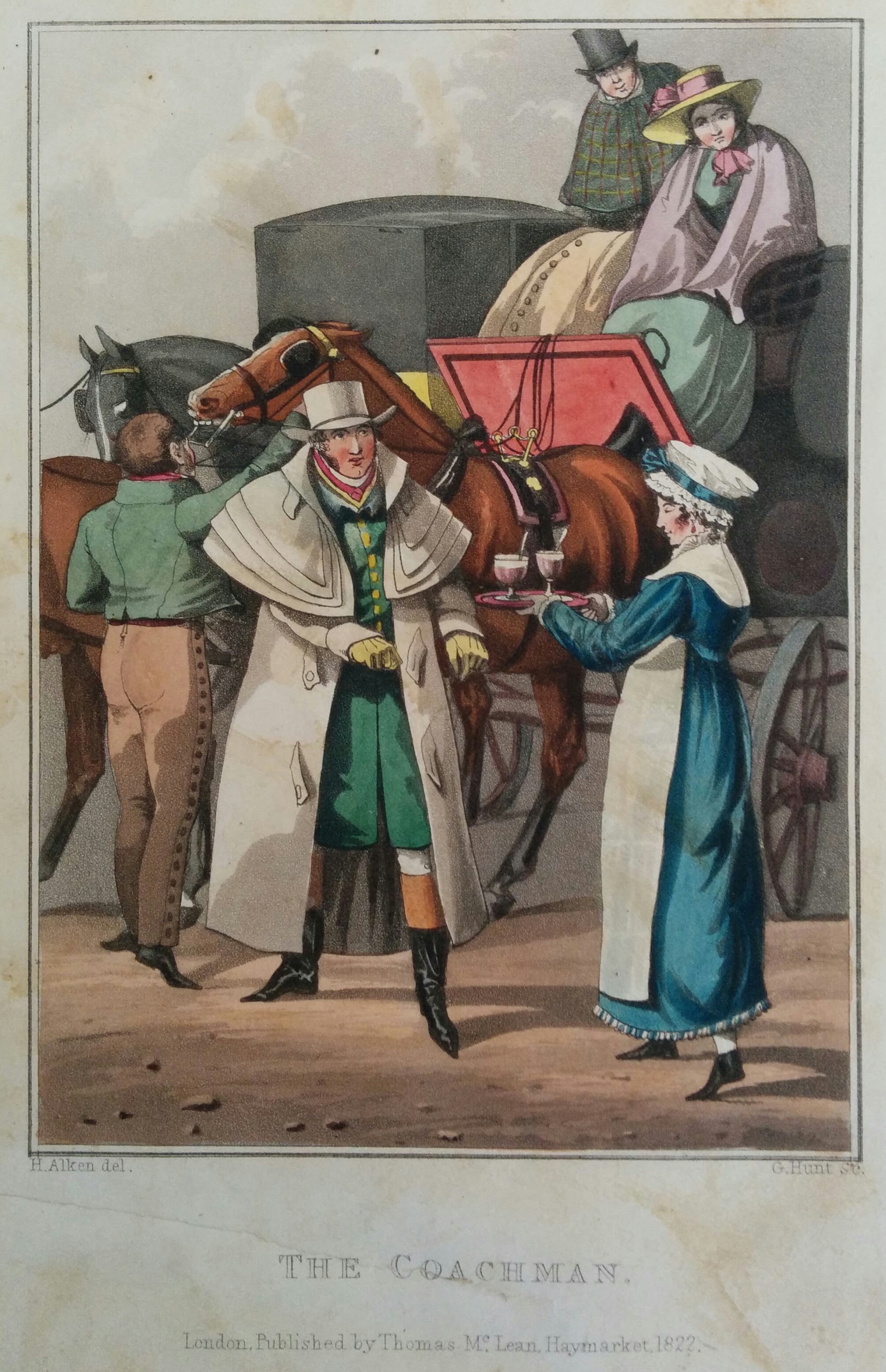 As I said in the previous ‘acquisitions’ post, I don’t really collect long-eighteenth century prints despite researching them. But what I have been on the look out for in recent months is example of prints that occupied the cheap end of the market or aren’t the best quality and therefore were less likely to have made it into the collections of memory institutions. And I’m glad I purchased these two for once I got them out of their frames it was clear that they display signs of how they were made and used, exemplifying some of the multi-modal functions of prints in this period (that is, they took many forms, appeared in many contexts).
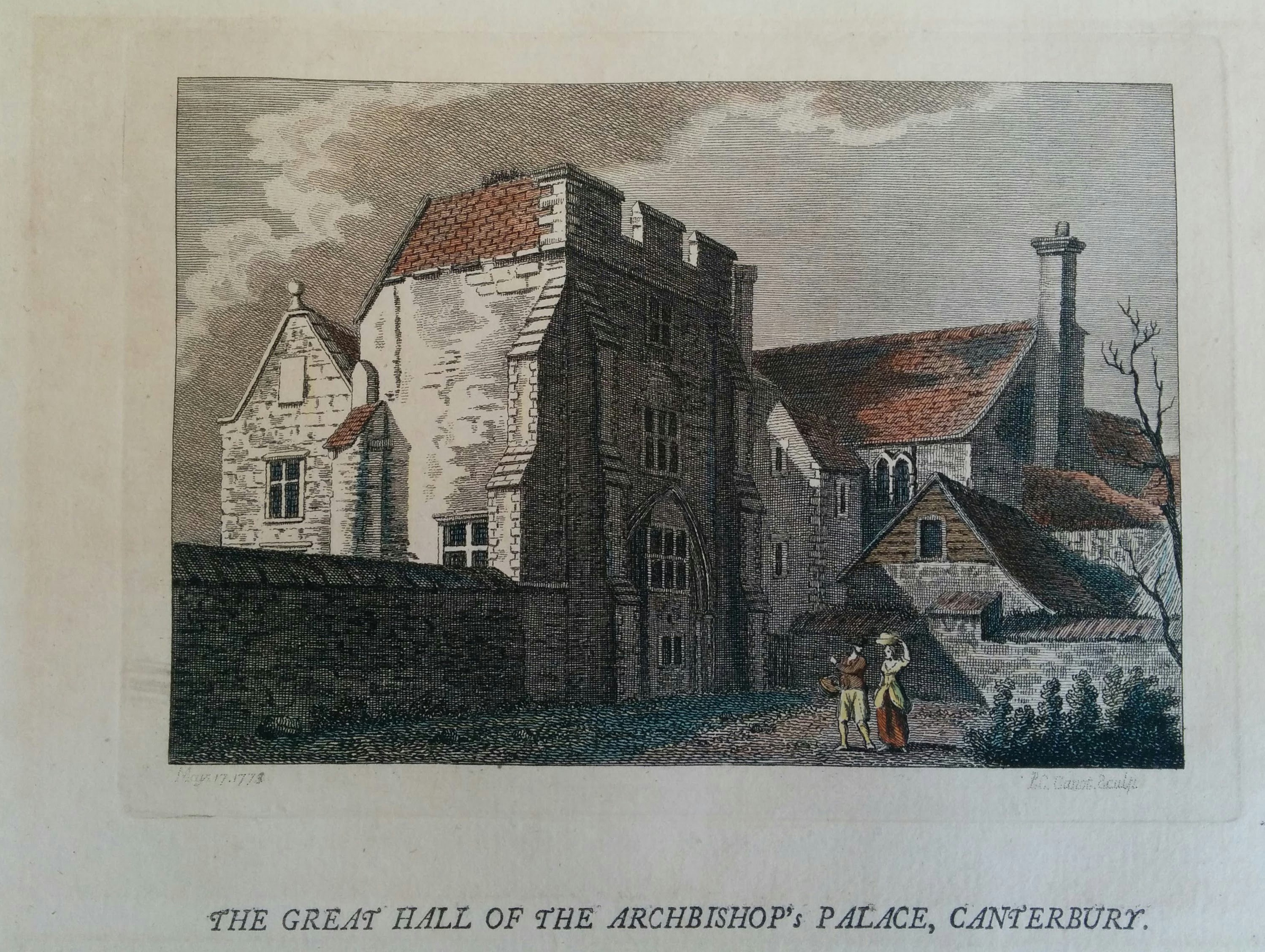 Starting with the Great Hall print, it contains a very obvious plate mark caused by the copper plate that contained the engraving pressing down on the wet paper during printing. Interestingly it also has printed text on the back, text that would have had to be added, using a different printing process to printing the image, to each object after each image pressing.
 The Coachman has some even more interesting signs of use, having clearly been ripped from a binding at some point: that is, an image printed from a copper plate separately to the text printed from moveable type, then bound in with those pages of text, then taken out again.
 In short, they both contribute to the thesis I put forward in my yet to be published book on the business of satire in the late-Georgian period around how the realities of that business (labour, processes, materials) could shape and constrain the content of prints. They also will be useful in my teaching. Next year I’m due to convene a new module on the mass produced image, a course hooked around the invention of the lithograph, the fact that this technology made it thinkable (if not immediately practical) to mass produce complex images, and what that meant for society and culture in relation to what came before and after. Alongside introducing some digital history methods via my own research practice in this area, I’m keen to get the students to work with eighteenth and nineteenth century printed objects from a material culture perspective, and so I’m hopeful that having my own little collection for them to touch, feel, smell and experience will really enhance their understanding of the printed image in this period.

Interesting approach which turns collecting convention on its head somewhat by placing emphasis on the less well-preserved copies of prints.
This ‘anti-collecting’ approach also highlights the lack of a clearly defined finished state for many c18th prints, with plates constantly being re-worked, re-printed and then coloured, bound, cut and paste in a variety of different ways before and after sale.
Obviously though some caution is also required as modifications, particularly those relating cutting, gluing and the addition of explanatory text could also be done by c19th and early c20th collectors who were far less reverential of these items.
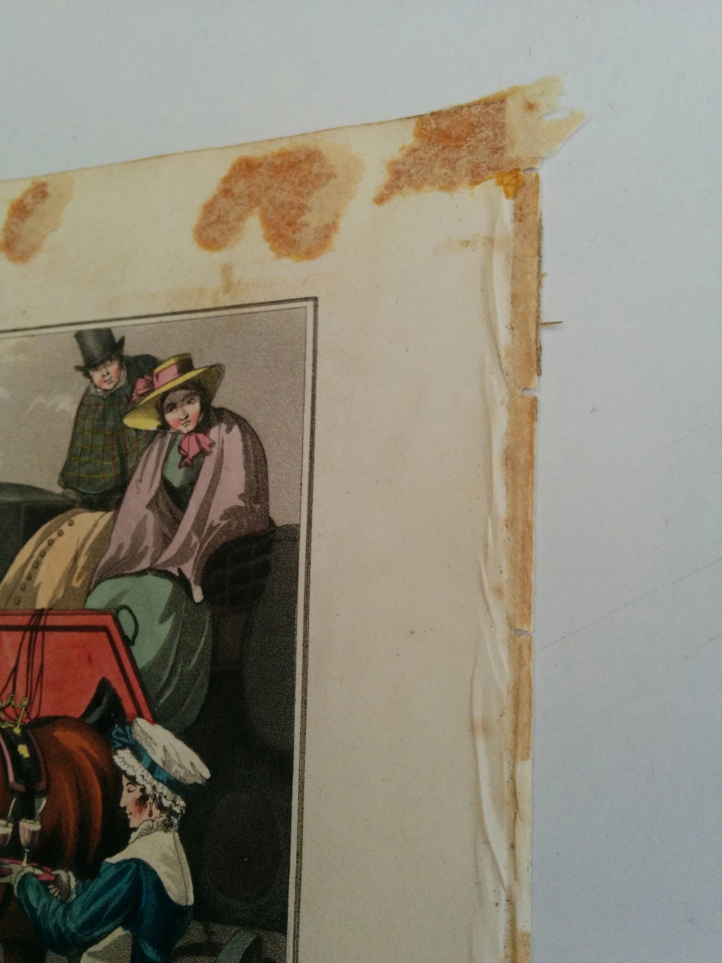
On the final point, of course. In the case of these two, the printing on the back of the Canterbury print seems contemporary (it has the long s) but when the other was bound I’ll never know. I guess what I’m interested in is the signs of prints as lived objects, regardless of whether that living was contemporary (all the blotchy marks around The Coachman for example look suspiciously like blu-tack stains to me!)
Great blog. I find it ironic, the complaints that modern political ads could not possibly be more satirical, when in fact prints and speeches – of the most respected figures of centuries past – were far more so. Keep up the good work from Erik at theoryofirony.