
The case often made for humanists (and indeed librarians, archivists, et al) to learn some code is that with programming comes control. That is, control to do what is possible within the bounds of possibility and talent (as opposed to within the bounds of what a Graphical User Interface driven program can or cannot do). And, so goes the case, with control asserted over what can be done, control over method follows (there is, of course, a massive caveat here for software – like data – never takes a view from nowhere, is never neutral: if my Software Sustainability Institute Fellowship has taught me anything, it is that).
It is often hard to get across the argument that code (nearly) equals control. For there is a learning curve until some control is acheived, a learning curve during which time your GUI suite may appear to be giving you all the control you think you are going to need. This post is an attempt to assert, from my making it up as I go along experience, the virtues of control through code.
I’ve been dabbling with R for some months. R allows you to manipulate structured data and to create graphs – or similar – based on that data. I began with R by working through Lincoln Mullen’s embryonic book Digital History Methods in R and then adapting Lincoln’s code to problems I had using the internet for further support (Rule One of learning code: always borrow code). It was hard going, not because R is hard to get (in fact, it is pleasantly human readable), but rather because R does both the data manipulation and data visualisation bits at the same time I struggled to learn both parts together and/or in isolation. In the end, I took to manipulating my data to the forms R liked in ways I knew (shell, Excel, manual editing) then using the graphical components of R. Once I was comfortable with these, I began to build back in the data manipulation bits. I’m now at the point where R advice on Stack Overflow makes sense, which – for me at least – tends to mean I’ve got over the initial “nothing makes sense I hate this” Col du Tourmalet sized hump in the road.
So, time for a play by play example of control ‘in action’ using some real data (being a retrospective re-enactment this is hardly Science in Action in the Latourian sense, suffice to say the real thing was much messier). The data for this play by play is very simple: it contains all the first names an NER process (and some manual post-processing) found in the descriptions of satirical prints c1770-1830 held at the British Museum (see Five graphs on speech acts in late-Georgian satires for my post recent post on this project), with a count for each decade, and a coding against the name as male or female. So we have four columns: NAME, N, GENDER, DECADE. I should add that this data was assembled from a much larger dataset (ultimately, from this SPARQL query on this interface) by both manual and semi-automated means so has some quirks I am happy to explain if you want to reuse the data (which you may! – see the CC logo on this page). Do also forgive my wonky R, it isn’t the best but does the job for me! And finally, you’ll need to install R if you want to do any of this yourself.
The obvious thing to do with this data is to make a histogram. BM_histogram.R does this.
The code does four main things: loads the packages we might need (we don’t need them all for this but I tend to leave them in there), loads the data, plots the data, saves the plot to a file.
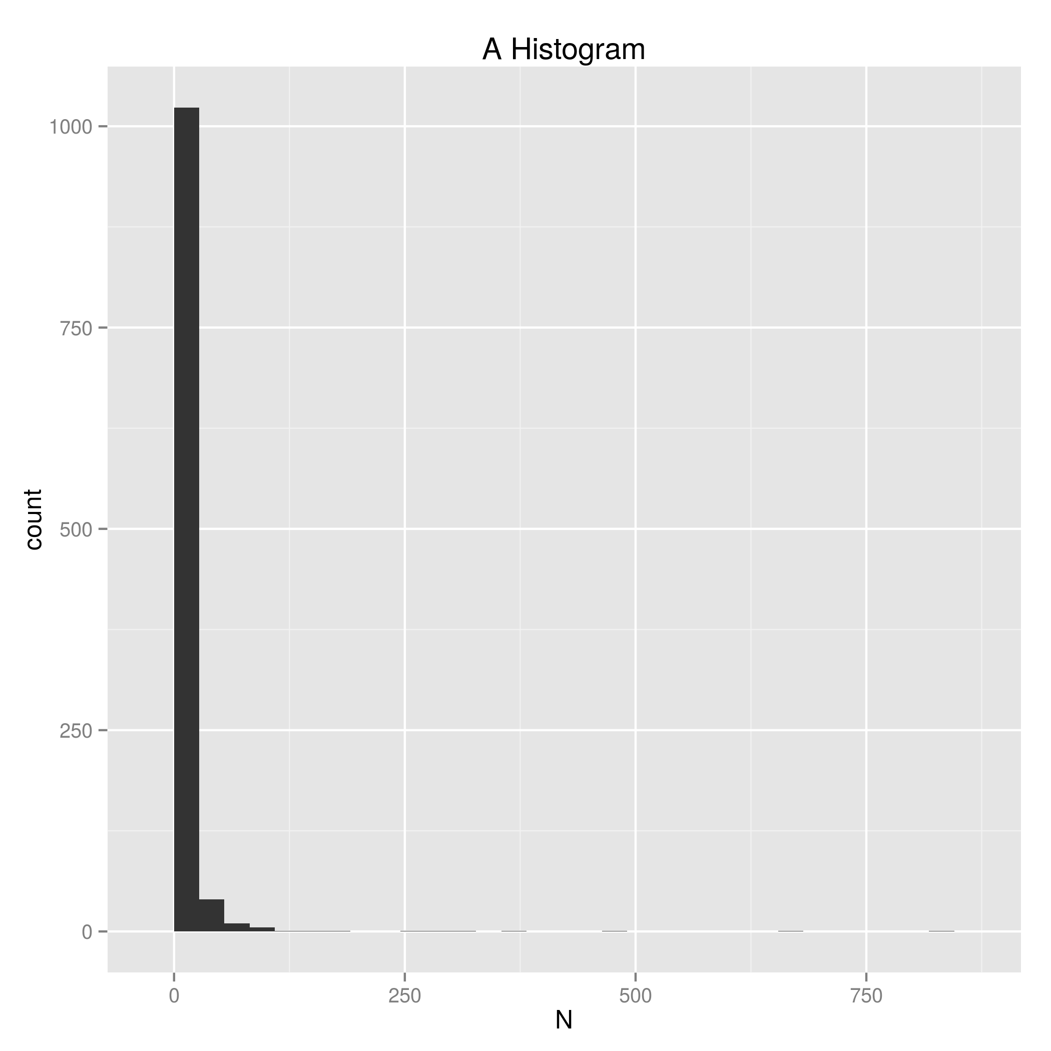
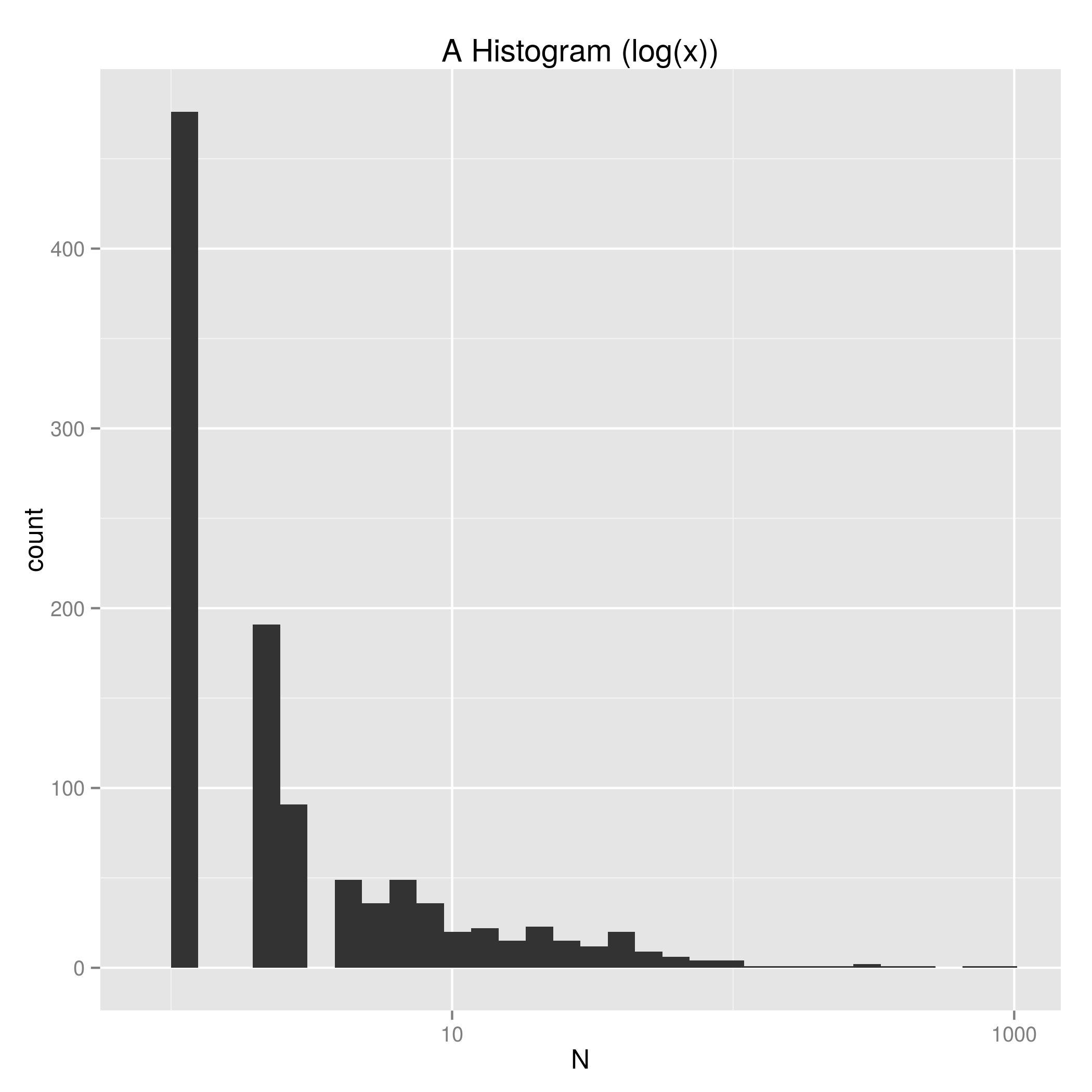
The graph tells us that many (many) first names only appear a small number of times. To get a better sense of the N > 2 data we can just add scale_x_log10() under ggplot2 and we get a plot with the x axis shown log(10). Figure 2 code.
To get a sense of how this differs by decade we just invoke facet_grid making the variable therein our DECADE column. Figure 3 code.

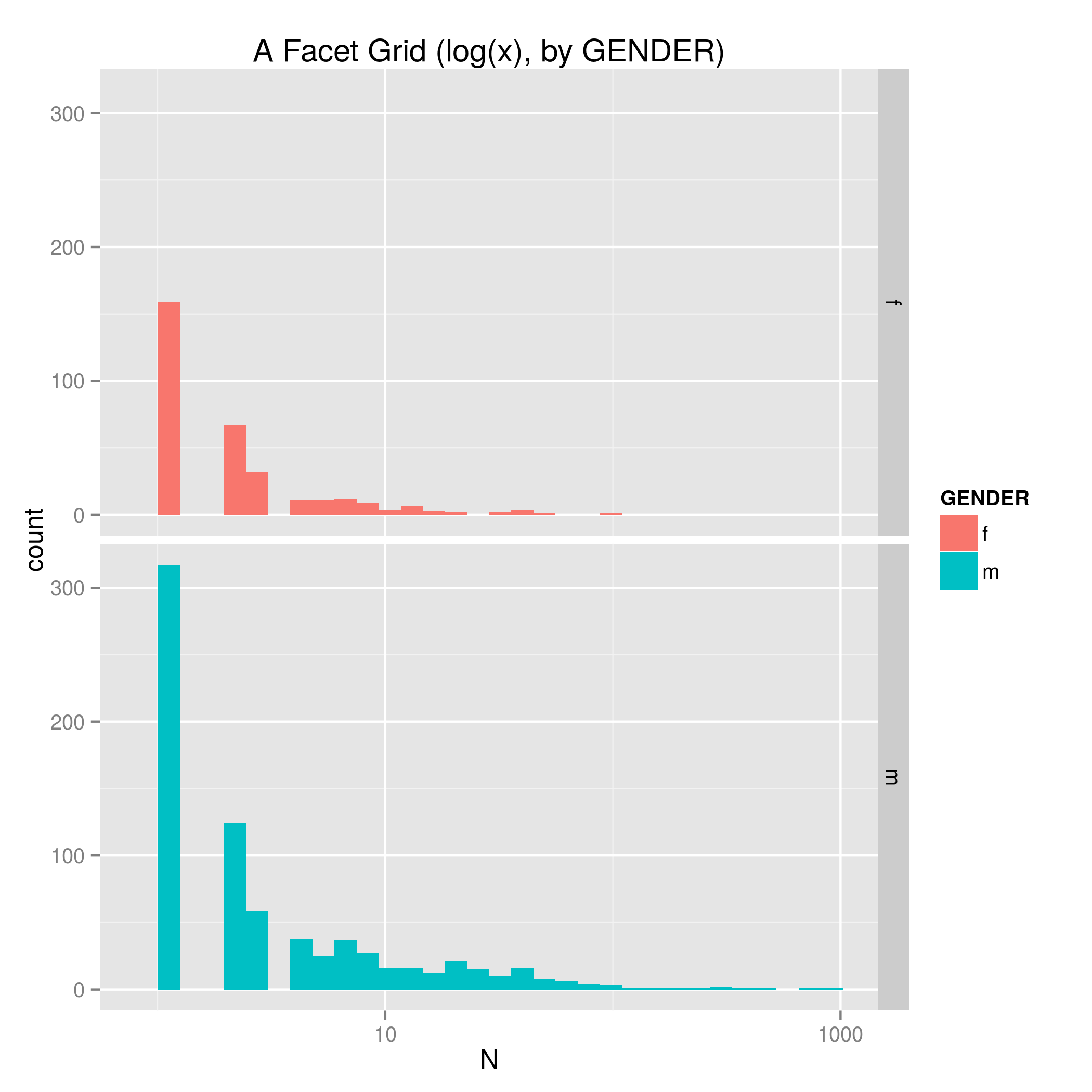
To seperate the data out by GENDER with the same plotting format we just replace facet_grid(DECADE ~ .) with facet_grid(GENDER ~ .). Figure 4 code.
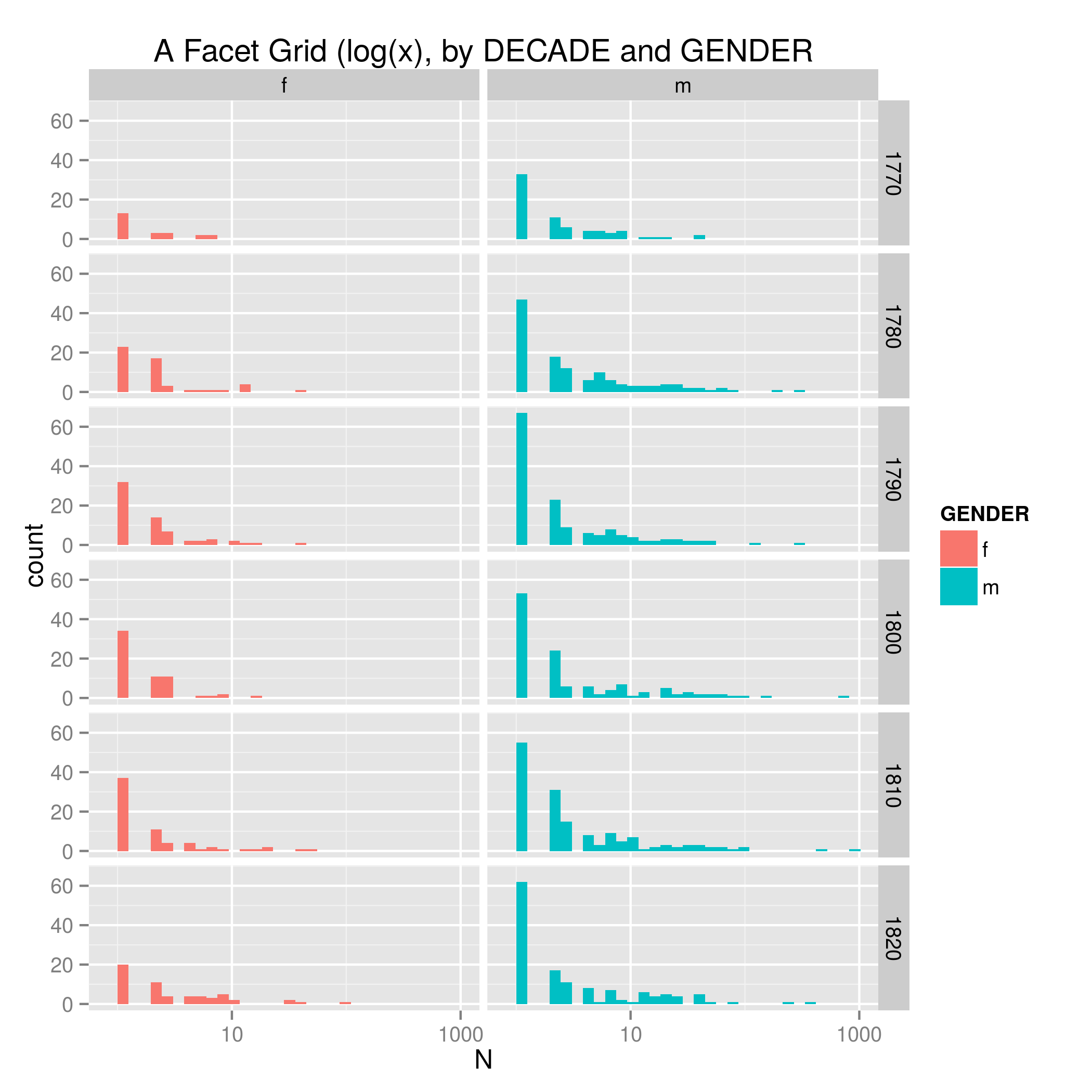
And to get both variables going at the same time, we just make this facet_grid(DECADE ~ GENDER). Figure 5 code.
Thus far I have only changed the parameters of ggplot2, the plotting package I am using. But – as I mentioned above – we can also rearrange the data before it gets to ggplot2.
By grouping the input data by DECADE we can generate a mean N value for each decade and plot that out. Figure 6 code.

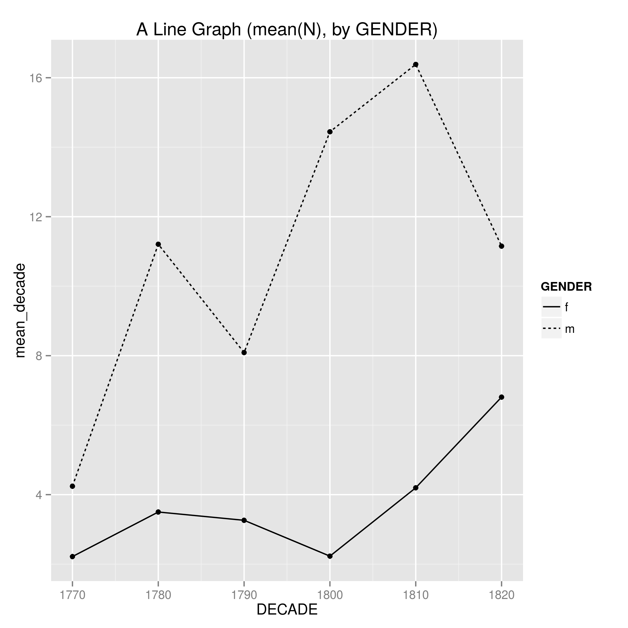
It is trivial from there to group by DECADE and GENDER to generate mean N values for both variables, and plot those out. Figure 7 code.
We can then revisit facet_grid to seperate these graphs out for readability. Figure 8 code.

Finally, we even present these as a nice chunky bar grid. Note how here I’ve added 5 to the DECADE values on the y-axis. This fixes an issue with the last three plots, for without this the bars – which if you recall represent a decade of data – would plot with their mid-point over the first decade of the year, thus looking like they represented data from – say – 1795-1804. Again, control. Figure 9 code

The final piece of control is that if my data changes for any reason I don’t need to manually rerun each plot again (NB: up to this point I being running everything from the shell using the syntax Rscript --vanilla NAMEOFSCRIPT.R. Taking a step back from R and into the the realm of things the unix shell can do, I just need a makefile (code) that when executed from the shell runs all the commands in the make file for me, taking into account the new data and any changes to the code (for more info on make, see the lesson at Software Carpentry.
There is lots more R based control I know of and haven’t shown here (manual colouring of fills, point types and sizes, more fancy data re-factoring) and plenty (plenty) more I don’t know about but is only a search away. And of course, other programming languages can do this stuff as well. In short, never again will I battle with making flat data viz in an office suite.
This isn’t just me mucking about with tech. These plots give me baselines from which to grapple with historical phenomena. These range from the obvious (there are lots of individual first names mentioned in descriptions of late-Georgian satirical prints, there are more male names mentioned than female names), to the not all that surprising (the mean of first names peaks during the Napoleonic wars when we find very regular names such as Charles (James Fox), George (‘III’), John (usually ‘Bull’), Napoleon (Bonaparte), and William (Pitt)), to the intriguing (the mean of female names mentioned grows between the 1810s and 1820s at the same time as the comparable mean of male names falls to below 1800-1809 levels). From here I can attack the source material, printed objects that contained satirical designs, afresh.

One thought on “Code, control, and the Humanities”